Improve your website’s UX using this psychological hack
To build great UX on websites we first need to understand how humans are perceiving different actions they make based on their prior knowledge or the environment they are in.
This process uses something called a mental model which is an explanation of someone's thought process about how something works in the real world. It is a representation of the surrounding world, the relationships between its various parts and a person's intuitive perception about their own acts and their consequences. Mental models can help shape behaviour and set an approach to solving problems (similar to a personal algorithm) and doing tasks.
As described by Don Norman in Design of Everyday Things, knowledge as a concept can be divided in two categories: knowledge in the head and in knowledge in the world.
Knowledge in the head
Knowledge in the head is what a person knows to do, requires learning and the use of memory such that a user would remember how to perform a certain action based on his prior experience.
Declarative knowledge (knowledge “of”)
- This is knowledge of facts and rules, regardless of whether they are true or not
- Example: Knowing your address or the fact that red light means stop
Procedural knowledge (knowledge “how”)
- Procedural knowledge is taught by demonstration and learned through practice and cannot precisely be explained how it is done.
- Procedural knowledge is largely subconscious.
- Example: Knowledge that enables a person to perform music, return a serve in tennis and move the mouth/tongue properly when saying a tongue twister.
Knowledge in the world
Knowledge in the world is where an interpretation can substitute for learning. A person can derive how to do a task by understanding the environment and the surrounding objects.
Example: People looking at a keyboard can learn how to use it by just looking at the letters.
Precise behaviour can rise from imprecise knowledge and follows 4 fundamental principles:
- Knowledge is both in the head and in the world. Combine
- Great precision is not required: Perfect behaviour results if the combined knowledge is sufficient to make an appropriate decision.
- Natural constraints exist in the world
- Knowledge of cultural constrains and convention exists in the head
Whenever knowledge needed to do a task is readily available in the world, the need for us to learn it diminishes.
Don Norman, Design of Everyday things
Example: We know how to delete a product from an online shopping cart if the delete icon looks like a trash bin.
Reminders and Natural Mapping to reduce memory load
Reminders are used to place knowledge in the world:
- Signal
- Message
Take for example a video game in which the controls are reversed: left buttons are switched with the right ones. You probably noticed using such controls isn’t easy, however it is an experiment that demonstrates stimulus–response incompatibility. Back in the 1950s, the psychologists Paul Fitts (well known in human–computer interaction for the law that bears his name) and Charles Seeger ran a series of experiments which demonstrated this concept. They asked people to respond to a stimulus that appeared on their left or right side by pressing two buttons:
- In one condition, the stimuli and the responses were on the same side: people had to use their left hand to press a button on their left when the stimulus appeared on the left (and their right hand when the stimulus was shown on the right).
- In another condition, the stimuli and the responses were on opposite sides: participants had to use their right hand to press a button on the right when the stimulus appeared on the left, and vice versa.
Fitts found that participants were faster in the first condition, which presented a stimulus–response compatibility. Stimulus–response compatibility is the degree to which the physical arrangement of the stimuli matches the location of the expected responses. Stimulus–response compatibility is highly relevant for design. When an object or an interface violates it, its usability decreases significantly.
Consider these two stoves as additional examples. Each stove has two different arrangements for their controls.
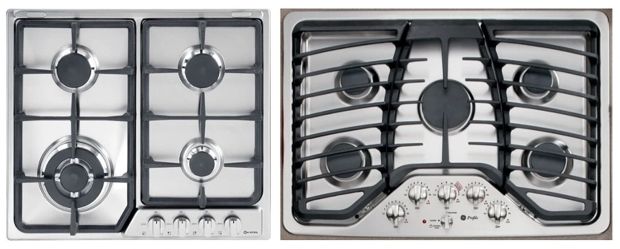
On the left, a typical stovetop arranges burners in a two–by–two grid and the controlling knobs aligned in a single row across the bottom. This design makes it difficult for users to guess which knob controls each burner (no stimulus–response compatibility). On the right, the arrangement of the controls mimics the arrangement of the five burners, and therefore has a higher stimulus–response compatibility.
If a design depends upon labels, it may be faulty. Labels are important and often necessary, but the appropriate use of natural mappings can minimize the need for them. Whenever labels seem necessary, consider another design.
Don Norman, Design of Everyday Things,
Natural mapping refers to a design in which the system’s controls represent or correspond to the desired outcome. When controls map to the actions that will result, systems are faster to learn and easier to remember.
Natural mappings bridge the gulf of execution, helping users to understand how a system can be used and what actions are required to accomplish their goal. Designers can create natural mappings in several ways, including the three common patterns below:
1. Spatial similarity
This pattern is pretty much the same as the stimulus–response compatibility. By arranging controls in a spatial layout that mimics the design layout, users can understand the system faster. For example, consider the screenshot below, taken from the Display Settings menu on a Mac. When multiple monitors are connected, the Display Arrangement screen allows users to rearrange the on-screen versions of the monitors to match the actual positions of the physical monitors. For users working on extended screens, this similarity of layout helps them quickly drag files from one monitor to the other, because the layout maps closely to how the monitors are arranged on the desk.
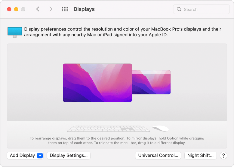
Arranging on-screen monitors to mimic the arrangement of the physical monitors is an example of natural mappings, which helps users move efficiently between monitors while working.
2. Conceptual or metaphorical similarity
Some designs take advantage of a commonly accepted metaphor and use that as the basis for design decisions. When done well, these metaphorical mappings can serve to make the system’s functions more transparent. Consider the brightness control in the iOS Control Center. Swiping up within the control increases the screen brightness, and swiping down on the control makes the screen darker. This arrangement matches the cultural metaphor of “high means more” and “lower means less”, therefore filling the bar higher would mean a much higher brightness. Designers can take advantage of such metaphors to create natural mappings, however the effectiveness of the mapping is largely dependent on cultural and social conventions.
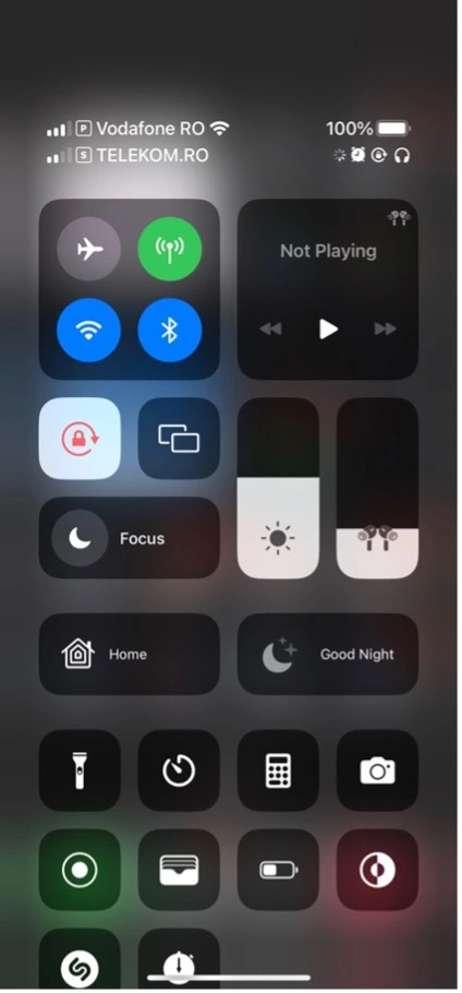
The brightness control in the iOS Control Center uses natural mapping by arranging the control so that swiping up raises the screen brightness (up is more) and swiping down darkens the screen (down is less).
3. Behavioural similarity
Users often have expectations about what will happen when they perform an action, and these expectations are often governed by their goals. Behavioural similarity is another form of system feedback in which the interface responds in a way that resembles the action that users perform. For example, when users are interested in consulting their watch, they will often move and tilt their hands to see the watch better. This behaviour was capitalized by the smartwatch designers in the “raise to wake” gesture. For a user to “wake up” the device, all that’s required is that she turn her wrist to look at the watch face. The device detects the movement and interprets the user’s intention to interact. The behaviour is so natural that users don’t have to recall a special function in order to get the device’s screen to turn on: the wake-up command has become a noncommand user interface.
Note that despite gestures becoming more common in devices and applications, they still present burdens and challenges to users. Many gestures are unnatural; they don’t relate to the actions users attempt to complete, and therefore they are harder to discover, remember, and execute. One exception is the rotate gesture on a trackpad, which is similar to how a person might rotate a photo in real life. But gestures that require complex interactions, such as two, three, or four-finger taps or swipes, are too difficult for average users to learn and recall correctly. When creating a gesture, designers must consider natural mappings if they want to have any hope of the gesture being adopted.
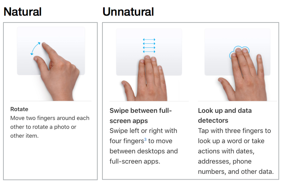
The rotate gesture on a trackpad (left) has a natural mapping to how a person might rotate an object in real life. However, many gestures, such as the four-finger swipe and three-finger tap, aren’t clearly associated to the action being carried out, and therefore they are challenging for users to learn and execute (Image source: support.apple.com/en-us/ht204895).
Trade-offs
| Property | Knowledge in the World | Knowledge in the head |
|---|---|---|
| Retrievability | Retrievable whenever visible or audible | Not readily retrievable. Requires memory search or reminding |
| Learning | Learning not required. Interpretation substitutes for learning. How easy it is to interpret information in the world depends upon how well it exploits natural mappings and constraints | Requires learning which can be considerable. Learning is made easier if there is meaning of structure to the material (or if there is a good mental model) |
| Efficiency of use | Tends to be slowed up by the need to find and interpret the external information | Can be very efficient |
| Ease of use at first encounter | High | Low |
| Aesthetics | Can be unesthetic and inelegant, especially if there is a need to maintain a lot of information. This can lead to clutter. In the end, aesthetic appeal depends upon the skill of the designer | Nothing need to be visible which gives more freedom to the designer which in turn can lead to better aesthetics. |
Most of the times creating a design that perfectly leverages mental models is hard and design mistakes go live unnoticed, impacting your conversion rates long term without even realising.
Flowpoint understands users’ behaviour on your website and detects such anomalies which have an impact on conversion rates.
Try it now, no credit card required!
Contact
FLOWPOINT ANALYTICS LTD
Company Number 14068900
83-86 Prince Albert Road, London, UK
© 2024. All rights reserved @Flowpoint