The ultimate CTA checklist: Best practices for boosting conversions
Call-to-action (CTA) buttons are vital for any software-as-a-service (SaaS) website to guide visitors through the marketing funnel, encouraging them to take specific actions, such as scheduling a demo or signing up for a trial or purchase. As a result, you can increase your conversions and sales and grow your business with proper CTAs.
So, what makes a CTA compelling? Here are our top 5 suggestions:
- Clarity
- Action-oriented language
- Contrast & shape
- Urgency
- Placement
Clarity
The most crucial aspect of a CTA is that it should be straightforward to understand. Keep it clear and short, from 1 word to 7 words in length. Visitors should know exactly what they will get by clicking on the button: a free trial, a discount, or access to a new feature. Hubspot says that over 90% of CTAs are less than five words long.
Action-oriented language
Use action-oriented language in your CTAs. Words like "Sign up now" or "Join for free" are more effective than passive phrases like "Learn more" or "Contact us." With these elements in mind, let's look at some of the best CTAs for SaaS companies:
- "Start your free trial" encourages users to sign up for a X-day free product or service trial.
- "Sign up now" encourages users to create an account or register for a service or product.
- "Book a demo" is particularly useful for SaaS companies that offer a complex product requiring a demonstration to understand its capabilities thoroughly. It's a great way to generate leads and provides an opportunity to engage with potential clients.
- "Get started" is helpful for easy and understandable products, encourages customers to take the first step in using the product, and allows them to explore the product before making a purchase.
- "Download now" can effectively increase conversions for SaaS companies offering free downloads.
- "Get a Quote" is compelling for SaaS companies that provide customized pricing and plans. Visitors can request more information about pricing and plans that fit their needs.
- "See Case Studies" suits companies with a track record of success and can demonstrate how their software has helped other businesses.
- "See Pricing" is used to provide more information about the cost of the software.
Contrast & shape
Make sure your CTA stands out from the rest of the website or landing page. Use contrasting colors, bold text, and large buttons to make it easy to find and click on.
According to Saastitute, more than 70% of SaaS websites have either a green or a blue CTA.
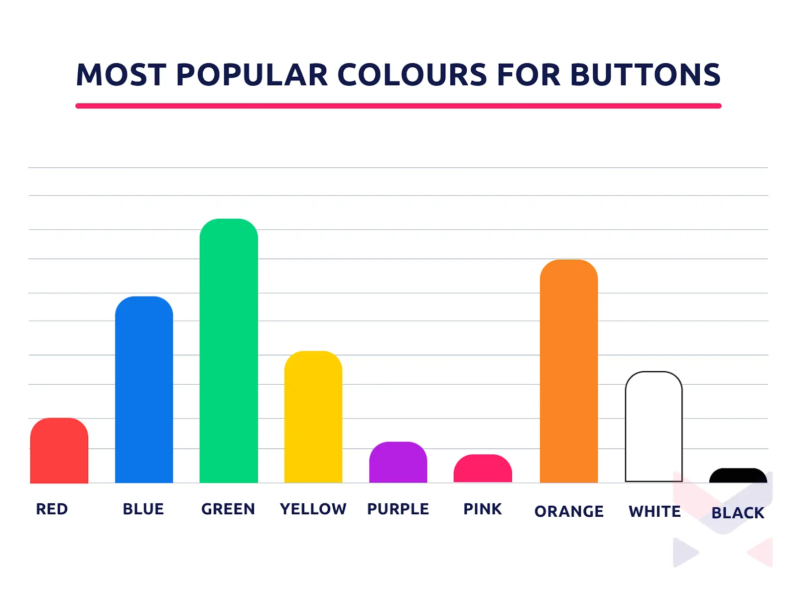 *Source: Mazepixel.
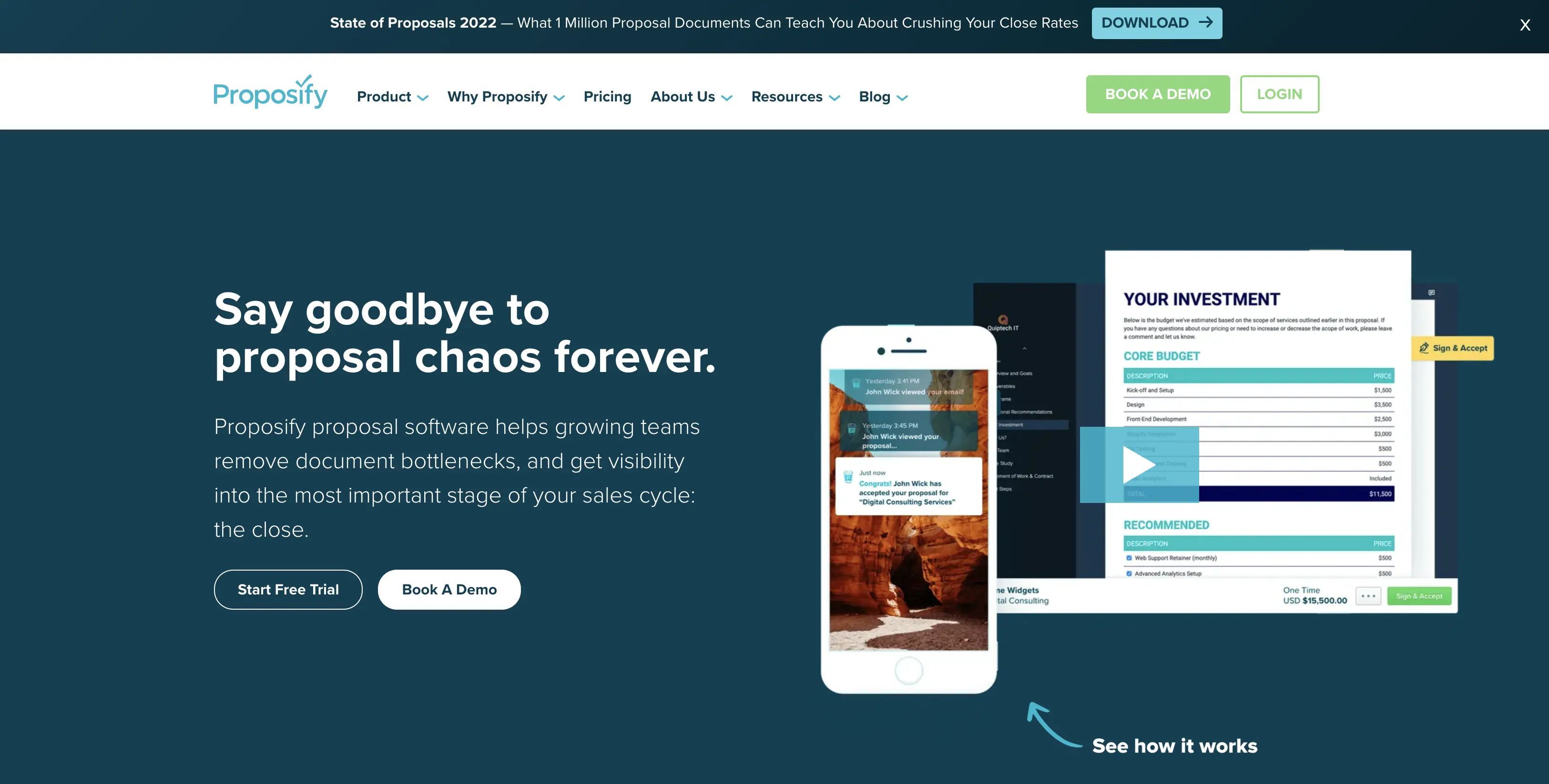
Therefore, there is no rule about keeping a single shape of a CTA button throughout your site. Instead, see how Proposify keeps its primary CTA and secondary CTA distinctive.
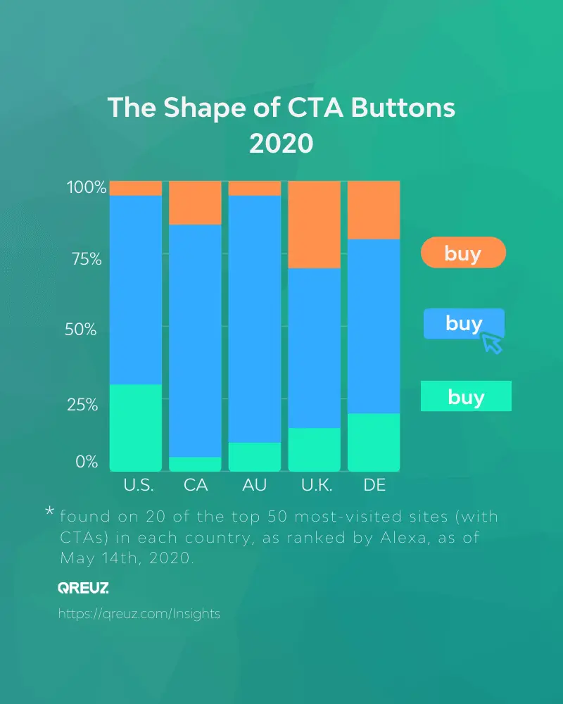
According to Qreuz, 35% of the CTA buttons on the most-visited sites in the U.K. are rounded, while the most popular CTA button shape, 50%, are rectangular with "soft" corners.
Urgency
Create a sense of urgency by using language that implies that the offer is only available for a limited time. CTAs like "Limited time offer," "Act now," "Book now," "Claim Your Discount Today," and "Sign up now" can help encourage visitors to take action immediately.
According to OptinMonster, here are some other common urgency words and phrases you should include on include to create urgency:
- FOMO (offer expires, final sale, now or never, price going up)
- Time (limited time, last time, now, today only, deadline, seconds, minutes)
- Scarcity (once in a lifetime, one day only, never again, last chance)
- Speed (instant, now, don't delay, act now, hurry, rush)
- Sale words (final close-out, offer, clearance, bargain, going out of business)
Placement
Make sure your CTA is prominently displayed and easy to find. Of course, CTA's position can vary from site to site. However, statistics from Mazepixel suggest that about 37% of the studied websites keep the CTA on the right side, while 29% are in the middle and the rest on the left.
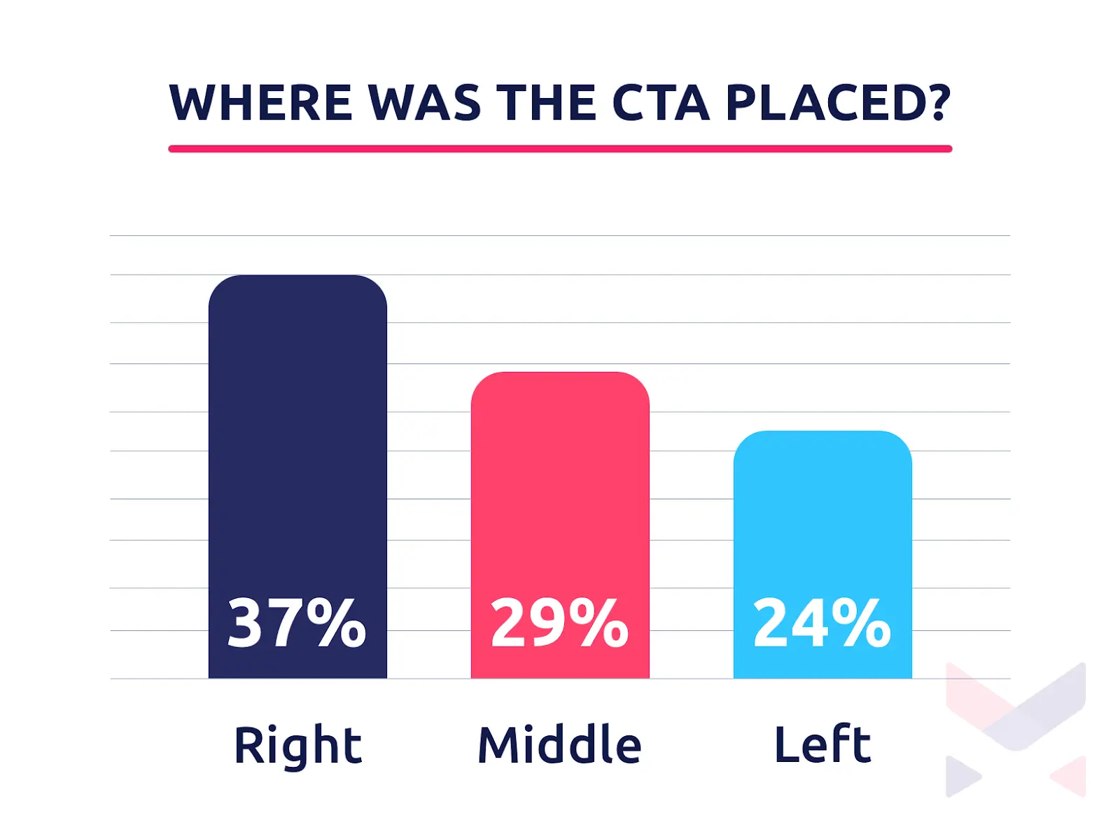 *Source: Mazepixel.
While there is no golden rule regarding where to place the button, its timing is essential to the website. Therefore, another point of discussion is "the fold" and whether to put it above or below.
..the fold is just a myth. Many times moving the call-to-action below the fold has shown to have a higher conversion rate. - VWO.
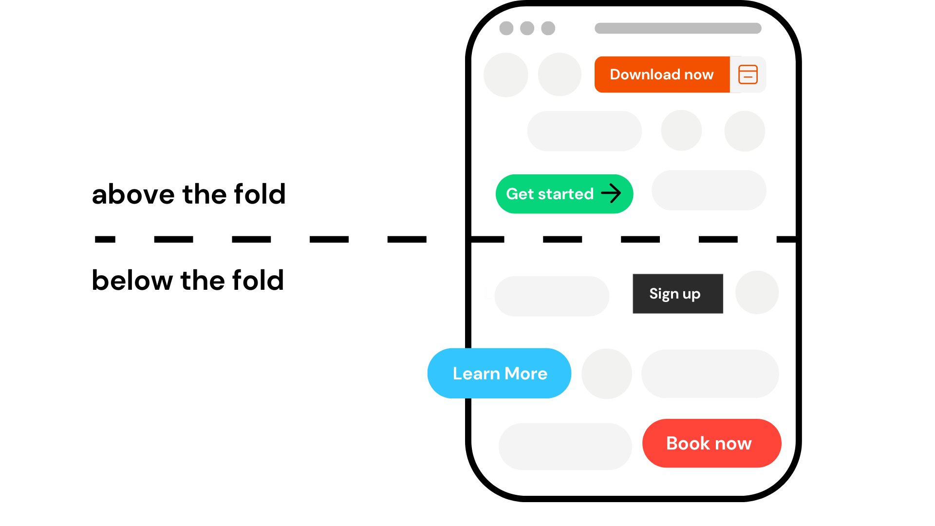
A few common and effective places to place a CTA on a SaaS website: are above the fold / below the fold, on the homepage, on the pricing page, on the product or feature pages, and the blogs and articles.
CTAs are crucial to any SaaS website or landing page. You can increase conversions and grow your business by using clear, action-oriented language, creating a sense of urgency, and ensuring the CTA stands out.
It's necessary to note that the effectiveness of CTAs can also depend on the specific product or service offered and the target audience.
Therefore, it's essential to constantly test and optimize CTAs to find the most effective approach for your business. For this purpose, Flowpoint can help you. All you need to do is create an account and funnels. Get started now.
Contact
FLOWPOINT ANALYTICS LTD
Company Number 14068900
83-86 Prince Albert Road, London, UK
© 2024. All rights reserved @Flowpoint