10 Common Mistakes to Avoid in Checkout Page Design
The checkout page is the culmination of a customer’s journey on an e-commerce website. It’s a make-or-break zone where design decisions can significantly affect conversions. Despite its importance, many businesses commit glaring mistakes that could lead to cart abandonment. Here are 10 common pitfalls to avoid when designing your checkout page.
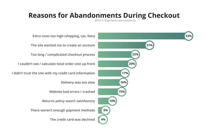 **Image source: Baymard Institute
1. Lengthy and Complex Checkout Process
A long and complicated checkout process can frustrate customers, leading to a high abandonment rate. According to Baymard Institute, 26% of online shoppers abandon their carts due to a “too long/complicated checkout process”1.
Solution: Simplify the checkout process by only requesting essential information and adopting a clean, streamlined design.
2. Hidden Costs
Unexpected costs like shipping fees, taxes, or additional charges can deter buyers. Nearly 56% of online shoppers abandon carts when they encounter unexpected costs1.
Solution: Be transparent about all costs upfront.
3. No Guest Checkout Option
Forcing users to register can drive away potential customers. About 31% of shoppers will abandon their carts if they’re forced to create an account1.
Solution: Always offer a guest checkout option.
4. Limited Payment Methods
Restricted payment options can be a hurdle for users who prefer different payment methods.
Solution: Offer multiple payment options, including credit/debit cards, PayPal, and other mobile payment methods.
5. Lack of Security Badges
Customers are wary of online fraud and data theft. Lack of trust badges can reduce conversions by as much as 42%2.
Solution: Display trust badges prominently on the checkout page.
Get a Free AI Website Audit
Automatically identify UX and content issues affecting your conversion rates with Flowpoint's comprehensive AI-driven website audit.
6. No Progress Indicator
Shoppers like to know where they are in the checkout process. Lack of a progress indicator can result in confusion and abandonment.
Solution: Use a step-by-step indicator to guide customers through the checkout.
7. Inadequate Error Handling
Poor error handling, like not highlighting incorrect or missing fields, can frustrate users.
Solution: Implement real-time error detection and provide helpful messages to guide the user.
8. Non-Responsive Design
With more consumers shopping on mobile devices, a non-responsive checkout page can be a conversion killer. In 2021, 54% of e-commerce sales were conducted via mobile devices3.
Solution: Make your checkout page mobile-responsive.
9. Lack of Reassurance Elements
Without elements like return policies, customer testimonials, or FAQs, customers might lack the confidence to finalize their purchase.
Solution: Incorporate these elements near the payment options to reassure users.
10. Ineffective CTAs
Vague or misleading call-to-action (CTA) buttons can hinder the checkout process.
Solution: Use descriptive, actionable language for your CTAs, like “Proceed to Pay” or “Finalize Purchase.”
Conclusion
While the importance of product pages and landing pages should not be overlooked, remember that the checkout page is where the actual conversion happens. Avoid these common mistakes to maximize your conversions and provide an excellent customer experience.