How to increase the conversion rate on your website: a step by step guide
Do you get a lot of traffic to your website that ends up leaving?
Ideally, these website visitors would complete an action, such as signing up, making a purchase, subscribing to a mailing list, etc.
These actions are examples of website conversions, which every business naturally wants more of.
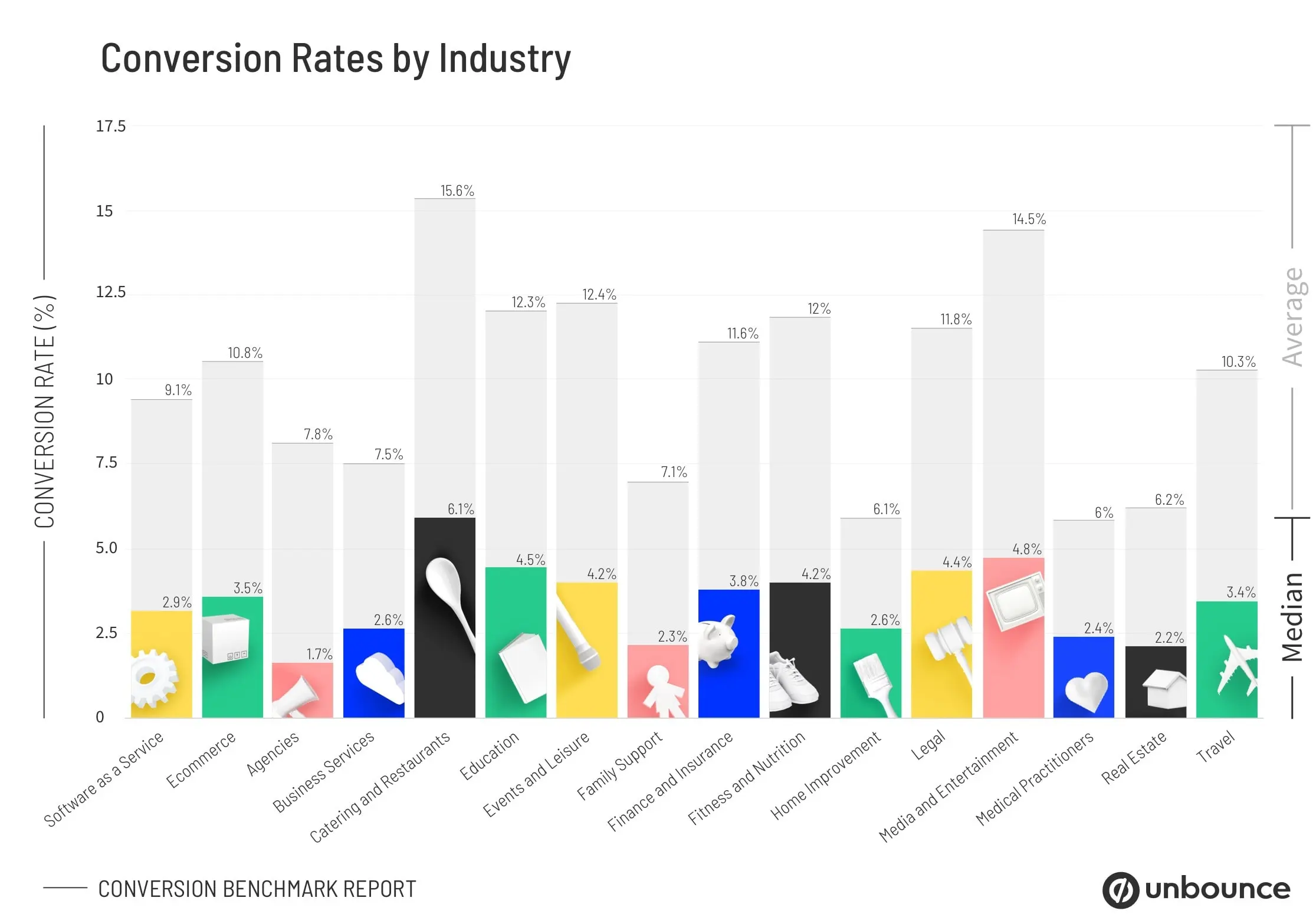
The average landing page conversion rate across all industries is around 2.35%, although the top 10% of pages are converting 11.45% of visitors or more.

The good news is that each of your visitors was interested enough to land on your website in the first place. Whether it was a compelling ad, a successful PR campaign, or some other kind of referral, they made it to your landing page.
The bad news is that something stopped them from converting into users, customers, or subscribers.
But what stopped them?
It can be a challenging question to answer, especially when you're overly familiar with your website. You get used to how everything works and can become blind to any obstacles that are getting in the way.
We've pulled together a handy checklist of ways to increase your website's conversion effectively.
15 ways to increase your website conversion rate
Once you've worked through each of these steps, your website will be in a much better position to convert more traffic.
1. Define your conversion priorities
Before you do anything, you'll need to think about which actions on your website will bring the most value to your business.
You may have several opportunities for someone to convert on your website, but which is your top priority?
Here are some examples of ways that businesses may want their users to convert:
- Create an account
- Book a demo
- Sign up for a free trial
- Check out
- Subscribe to newsletter
2. Design your conversion funnel
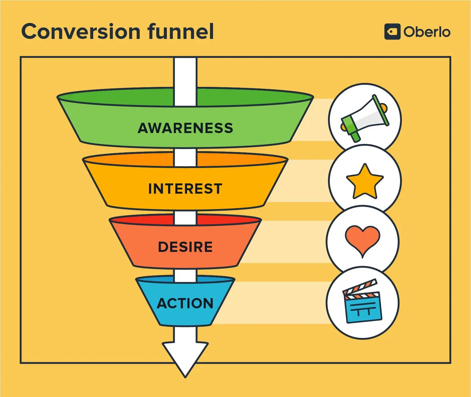
Your conversion funnel illustrates what the ideal user journey would look like.
Naturally, you'll have to drop off at each stage of the funnel for whatever reason. However, the aim is to optimise that funnel to prevent as much drop-off as possible.
Here's an example of a typical conversion funnel:

Depending on your business or sales cycle, a user could make their way through your conversion funnel in minutes, days, or months.
Now that you're better understood your ideal sales funnel let's consider getting it air-tight.
3. Start collecting visitor data
As we touched on before, it can be challenging to understand what's causing the problem when you're too close to something.
That's why relying on data is essential, rather than your own ideas or assumptions.
You'll need a good user tracker and behaviour analysis tool to collect and analyse this valuable data.
With Flowpoint, you can track the user flows that matter to your business to see exactly where users are dropping off and determine why they're not converting.
The website analytics tool not only shows you granular user insights but can also provide specific on-page improvement recommendations that are proven to increase conversion rates.
4. Consider a redesign
With the help of your web analytics tool, you'll be better positioned to spot any particular problem areas.
Though you may find that just a couple of tweaks can significantly boost your conversion rate, in some instances, you may need to consider a redesign of your page layout.
Your website should be clear and easy to navigate. If too much information is crammed in, or the layout is confusing to first-time visitors, you could risk losing out on conversions.
5. Optimise your copy
Sticks and stones may hurt my bones, but words can hugely impact my website's conversion rate.
At least, we think that's how the saying goes…
All jokes aside, the copy on your website is critical to conversion.
You'll need it to be clear and concise while communicating the features of your product or service, demonstrating the value of your brand and product, and persuading the user to take action — that's a lot to try to pack into a few impactful words.
But when you nail it, your conversions will rocket.
6. Start a brand blog
Speaking of great copy, it's always a good idea to have a blog on your website. It creates another channel for you to provide value to your potential customers.
For people who haven't encountered your brand before, a blog is another way for them to find you. When they're searching for answers around your niche, you want one of your articles that contains the answer to pop up right when they need it.
For those who may already be familiar with your brand but still need to convert, it can be a source of building trust. They can spend some time reading your content to see how knowledgeable you are about solving their problems before finally converting.
7. Write a good CTA
Your call to action (CTA) will tell your users exactly what they need to do when they're on your website.
Your CTAs should be determined by your conversion priorities, which we established in point one.
When designing your CTA buttons, you'll want to consider the following:
- Clarity
- language
- Contrast & shape
- Urgency
- Placement
Learn more about writing a CTA that converts here.
8. Add a live chat
When a user can't find an answer on your website, it can be frustrating and lead to drop-off.
Integrating a live chat tool is a great solution that lets your users hop on to get a quick answer.
9. Shorten any forms
When users see long forms, it's an immediate turn-off. Who's got the time?
Shortening your forms will take less time for your users to fill out and increase their likeliness of converting.
Only include the information that you really need in your forms.
10. Perform a competitor analysis
If users aren't converting to your website, they may have gone to a competitor. But first, you need to understand why.
Put your customer's shoes on — figuratively speaking, of course — and research each of your main competitors.
What are they offering that you're not? What does their user journey look like? Are they offering more incentives? Do they provide more educational information than you do?
If you were the customer, whose services or products would you choose and why?
Be completely honest with yourself here.
11. Demonstrate your unique selling proposition
Now that you've looked into your competitors, you may better understand your unique selling proposition (USP).
What are you offering that they're not? What sets you apart from the rest? Why would a potential customer choose you instead of them?
Ensure that your USP is woven throughout your titles, images, and copy.
12. Run A/B tests
So, how do you decide which page layout is best? Which headline works well? Or which CTA leads to more clicks?
Through A/B testing, of course!
You can deploy different versions of your website to different cohorts of users. You can determine these cohorts by geographical location, time, etc.
Whichever tests you run that lead to the most conversions wins!
13. Run user tests
Before any update goes live, you'll need to ensure you've tested it rigorously.
You want to catch as many bugs or problems as possible to prevent your users from encountering them.
Unfortunately, you won't be able to catch them all. Some users will be wonderful enough to report any bugs they find, but the vast majority will just leave.
Thankfully, there is another way to spot them.
User behaviour tools like Flowpoint can spot website errors that are popping up. Flowpoint can also see when a user is randomly reloading the page or rage-clicking — both of which are usually good indicators that something's gone wrong.
14. Include testimonials or reviews
Customer testimonials and reviews can have a significant effect on conversion rates.
According to research, 97% of people factor customer reviews into their buying decisions, while 92% hesitate to make a purchase if there are no customer reviews.
Ask your favorite customers to share a few kind words about your products or services. Feature them on your landing page, then sit back and watch the conversions roll in.
15. Improve your page speed
Don't underestimate the importance of how quickly your website loads — on both mobile and desktop.
You may hope that your customers will wait around and forgive slow loading speeds, but we can promise you that they're not.
Did you know that a website that loads in one second has a conversion rate three times higher than one that loads in 5 seconds?
That's right. You could triple your conversions by shaving just four seconds off your loading speed.
Boost your conversions with Flowpoint
Flowpoint helps businesses to build websites that convert.
From breaking down your user funnels to measuring campaign performances and analysing user activity, our innovative tool provides a better understanding of user behaviour.
Contact
FLOWPOINT ANALYTICS LTD
Company Number 14068900
83-86 Prince Albert Road, London, UK
© 2024. All rights reserved @Flowpoint